
EOH Astro 5 Theme
Overview
The EOH Astro 5 Theme is a highly customizable and versatile Astro-based theme. It comes equipped with essential components like breadcrumbs, headers, footers, and sidebars for seamless navigation. The theme supports dynamic content creation, including features such as blog collections, landing pages, static pages, and GitHub Discussions integration.
Features
- Header and Footer: Easily customizable components.
- Blog Pages:
- Blog listing page.
- Blog detail page.
- Expectations & Outcomes Collection:
- Generates a sidebar menu from items in
src/content. - Sidebar is a customizable component.
- Generates a sidebar menu from items in
- Landing Page: Includes cards, mission, and vision sections etc.
- Custom Pages: Easily add new pages as needed.
Getting Started
Local Setup Guide for Expectations-Outcomes-Hub (EOH) Theme Site
To run the EOH theme site demo locally, it’s recommended to first set up your Engineering Sandbox.
📘 Note: If you haven’t set up the Engineering Sandbox yet, follow the guide here:
https://github.com/netspective-labs/home-polyglot
🚧 Prerequisites
Make sure the following tools are installed and properly configured:
1. Node.js
Ensure Node.js version 20.9.0 or higher is installed.
Check version:
node -v2. pnpm (Package Manager)
This project uses pnpm as the package manager.
Install it globally if not already installed:
pnpm version must be 9.12.0
npm install -g pnpm3. Surveilr
Surveilr is required for this project. Install it using eget:
eget opsfolio/releases.opsfolio.com --asset tar.gz --tag=1.8.4Confirm the version:
surveilr --version
# Expected output: surveilr 1.8.4
⚙️ Project Setup Steps
1. Clone the Repository
git clone https://github.com/strategy-coach/expectations-outcomes-hub-theme-jan-2025.git
cd expectations-outcomes-hub-theme-jan-2025
2. Copy Environment Variables
Copy .env.example to .env:
cp .env.example .env3. Configure Environment Variables
Open the newly copied .env file and fill in the required values according to your local setup and credentials.
4. Install Dependencies
pnpm install5. Enable Local Search
pnpm run pagefind-search6. Build the Site
pnpm run build7. Start the Development Server
pnpm run dev🔄 Final Step: Sync Data Models
Once the dev server is running:
- Open the site in your browser.
- Go to the Profile page from the top-right menu.
- Click on the “Sync now” button.
(This will synchronize Data Models and Zitadel Users.)
GitHub Discussions Integration
This theme demonstrates integration with GitHub Discussions using the github-discussions-blog-loader.
Setup
-
Copy Environment Variables:
Copy.env.exampleto.env:cp .env.example .env -
Configure Environment Variables:
Update the.envfile with the following values:PUBLIC_GITHUB_TOKEN: GitHub Personal Access Token with read access to discussions.PUBLIC_GITHUB_REPO_NAME: Repository name.PUBLIC_GITHUB_OWNER_NAME: Repository owner (user or organization).
Example:
PUBLIC_GITHUB_TOKEN=ghp_xxxxxxxxxxxxxxxxxxx PUBLIC_GITHUB_REPO_NAME=your-repo-name PUBLIC_GITHUB_OWNER_NAME=your-username -
Use the GitHub Discussion Loader Component:
Import and include the component in your Astro templates:--- import GithubDiscussionLoader from "../components/github_discussion/githubDiscussion.astro"; --- <GithubDiscussionLoader />
ZITADEL Authentication Component
Easily integrate ZITADEL authentication into your project.
-
Update Environment Variables:
Add the following to the.envfile:PUBLIC_ZITADEL_CLIENT_ID="your-client-id" PUBLIC_ZITADEL_AUTHORITY="your-authority" PUBLIC_ZITADEL_REDIRECT_URI="your-redirect-uri" PUBLIC_ZITADEL_LOGOUT_REDIRECT_URI="your-logout-redirect-uri" PUBLIC_ZITADEL_ORGANIZATION_ID="your-organization-id" PUBLIC_ZITADEL_PROJECT_ID="your-project-id" PUBLIC_ZITADEL_API_TOKEN = xxxxxxxxxxxxxxxxxx -
Use the Authentication Component:
Import and use it in your templates:--- import { Authentication } from "../components/zitadel-authentication"; import { zitadelConfig } from "../utils/env"; --- <Authentication clientId={zitadelConfig.clientId} authority={zitadelConfig.authority} redirectUri={zitadelConfig.redirectUri} postLogoutRedirectUri={zitadelConfig.postLogoutRedirectUri} organizationId={zitadelConfig.organizationId} projectId={zitadelConfig.projectId} operation="login" /> -
Example Usage:
-
Login:
<Authentication operation="login" /> -
Logout:
<Authentication operation="logout" />
-
Demo Login Credentials
| Username | Password |
|---|---|
| eoh_demo@eoh.com | Demo@eoh1234 |
Folder Structure
├── LICENSE
├── README-Theme.md
├── README.md
├── astro.config.mjs
├── package.json
├── pnpm-lock.yaml
├── public
│   ├── assets
│   │   ├── images
│   │   └── styles
├── src
│   ├── components
│   │   ├── ContentEditor.tsx
│   │   ├── EditMarkdownButton.jsx
│   │   ├── LatestUpdates.astro
│   │   ├── PageFind.astro
│   │   ├── Sidebar.tsx
│   │   ├── github_discussion
│   │   │   ├── githubDiscussion.astro
│   │   │   ├── githubDiscussionDetails.tsx
│   │   │   └── githubDisscussion.tsx
│   │   ├── profile
│   │   │   ├── editProfile.tsx
│   │   │   ├── gravatar
│   │   │   │   └── Gravatar.tsx
│   │   │   ├── profile.tsx
│   │   │   └── userService.tsx
│   │   └── zitadel-authentication
│   │       ├── index.js
│   │       ├── login.jsx
│   │       └── zitadelAuthentication.astro
│   ├── content
│   │   ├── blog
│   │   ├── documentation
│   │   ├── expectations
│   │   ├── outcomes
│   │   └── progress
│   ├── content.config.ts
│   ├── layouts
│   │   ├── Footer.astro
│   │   ├── Header.astro
│   │   └── Layout.astro
│   ├── middleware
│   │   └── index.ts
│   ├── pages
│   │   ├── blog
│   │   │   ├── [...slug].astro
│   │   │   └── index.astro
│   │   ├── contact
│   │   │   └── index.astro
│   │   ├── discussions
│   │   │   └── index.astro
│   │   ├── documentation
│   │   │   ├── [...slug].astro
│   │   │   └── index.astro
│   │   ├── edit-profile.astro
│   │   ├── expectations
│   │   │   ├── [...slug].astro
│   │   │   └── index.astro
│   │   ├── index.astro
│   │   ├── logout.astro
│   │   ├── mission-vision
│   │   │   └── index.astro
│   │   ├── my-profile.astro
│   │   ├── no-permission.astro
│   │   ├── outcomes
│   │   │   ├── [...slug].astro
│   │   │   └── index.astro
│   │   ├── post-authorization.astro
│   │   ├── progress
│   │   │   ├── [...slug].astro
│   │   │   └── index.astro
│   │   └── qualityfolio.astro
│   └── utils
│       ├── env.ts
│       └── helper.astro
├── support
│   └── ci-cd.sh
├── tailwind.config.js
├── theme.config.ts
├── tsconfig.json
└── visualizing-expectations-outcomes.md
Qualityfolio Configuration
To configure Qualityfolio, add the URL to your environment variables:
PUBLIC_QUALITYFOLIO_URL="xxxxx"Replace xxxxx with the appropriate URL.
Customization
- Update
headerandfootercomponents to match your branding. - Add or modify pages in the
src/pagesdirectory. - Customize the sidebar menu by editing
src/content.
Theme Configuration
The theme.config.ts file allows you to customize certain aspects of the site’s theme, including the logo, title, admin email, active project name, tracker details, navigation menu etc. These configurations are passed as an object to the themeConfig function.
Example Configuration
// theme.config.ts
export default themeConfig({
  logo: "/assets/images/logo.png",
  title: "EOH Astro 5 Site",
  organization: "EOH Hub",
  adminEmail: "admin@example.com",
  description:
    "Welcome to the Expectations and Outcomes hub of EOH Astro 5 Site. This is your go-to resource to all activities regarding EOH Astro 5 Site products.",
  activeProject: "EOH",
  trackers: [
    { name: "Product Bug Tracker", url: "https://example.com/bug-tracker" },
    { name: "Google Analytics", url: "https://analytics.google.com" },
    { name: "Product Reported Issues", url: "#" },
  ],
  contentCollectionSort: "true",
  staticFixedFolders: [
    { parent: "progress", child: ["activity-logs"] },
    { parent: "outcomes", child: ["deliverables"] },
    {
      parent: "expectations",
      child: ["key-milestones", "roles-and-responsibilities"],
    },
  ],
  editLink:
    "https://github.com/strategy-coach/expectations-outcomes-hub-theme-jan-2025/edit/main/src/content/",
  baseHyperLinkColor: "#028db7",
  presentationBgColor: "#1e3a47",
  headerMenu: [
    { label: "Home", path: "/" },
    { label: "Documentation", path: "/documentation" },
    { label: "Expectations", path: "/expectations", requiresAuth: true },
    { label: "Outcomes", path: "/outcomes", requiresAuth: true },
    { label: "Progress", path: "/progress", requiresAuth: true },
    { label: "Qualityfolio", path: "/qualityfolio", requiresAuth: true },
    { label: "Blog", path: "/blog" },
  ],
   unauthorizedPages: [
    "documentation",
    "blog",
    "logout",
    "no-permission",
    "presentation",
  ],
  isHomePagePublic: true, // Set this to false if the homepage should require authentication
  authorizedSlides: [5], // Example: Only slides 5 require authentication
});
Home Page Widgets
Theme includes widgets designed for the home page: Skip To, Key Resources, Meeting Minutes, Accomplishments and Latest Accomplishments. These widgets dynamically display content based on Markdown files with specific frontmatter configurations. If no Markdown files contain the required frontmatter configuration for a widget, the corresponding widget block will not appear on the page.
Widgets Overview
1. Skip To
-
Displays a list of titles from Markdown files configured with the skipTo frontmatter.
-
    home:
       skipTo:
          category: "skipTo"
- You can add multiple Markdown files with this configuration, and their titles will appear under the Skip To card.
2. Key Resources
-
Displays a list of titles from Markdown files configured with the keyResources frontmatter.
-
    home:
       keyResources:
          category: "keyResources"
- Multiple Markdown files can be added with this configuration, and their titles will appear under the Key Resources card.
3. Latest Accomplishments
-
Displays a list of content items sorted by date. The content is sourced from Markdown files with a date field in the frontmatter.
-
date: “2025-01-01”
-
Content is displayed in descending order of the date field, ensuring the latest accomplishments appear first.
4. Accomplishments
-
Displays a list of titles from Markdown files configured with the accomplishments frontmatter.
-
    home:
       accomplishments:
          category: "accomplishments"
5. IT Governance, Risk and Compliance
-
Displays a list of titles from Markdown files configured with the ItGovernance frontmatter.
-
home: ItGovernance: category: "it-governance" -
Multiple Markdown files can be added with this configuration, and their titles will appear under the IT Governance, Risk and Compliance card.
6. Meeting Minutes
-
Displays a list of titles from Markdown files configured with the meetingMinutes frontmatter.
-
home: meetingMinutes: category: "meetingMinutes" -
Multiple Markdown files can be added with this configuration, and their titles will appear under the Meeting Minutes card.
7. Featured Blogs
-
Displays a list of titles from Blog files configured with the featured frontmatter.
-
    home:
      featuredBlog: true
- Multiple Markdown files can be added with this configuration, and their titles will appear under the Featured Blogs card.
8. What’s Next?
This widget displays a list of files from the frontmatter where the whatsNext attribute is set and the status is marked as “ongoing”. It provides a structured way to highlight important next steps for users.
Features
-
Lists files with the whatsNext attribute in the frontmatter.
-
Filters and displays items with status “ongoing”.
-
Displays the summary attribute as the title in the UI.
-
Supports redirecting files to an external .lhc-form.json path.
-
Allows files to be hidden from direct navigation by setting draft: true.
Frontmatter Configuration
Each markdown (.md) file must include the following attributes in its frontmatter to be processed by the widget:
title: “Complete Questionnaires” summary: “Customer: Fill the SOC2 questionnaire - Control Environment Evidence Collection Form” home: whatsNext: category: “whatsNext” order: 4 status: “on going” redirect: “/expectations/questionnaire/plan-1/general-information-evidence-collection.lhc-form.json/” draft: true
Handling Redirects
To support redirections, ensure that the redirect frontmatter is passed in slug.astro where the layout is called:
<Layout redirect={ entry.data.redirect }>Usage
-
Create a new Markdown file in the content directory.
-
Set whatsNext under home in the frontmatter.
-
Add a summary to describe the item in the UI.
-
If redirection is needed, specify the redirect path and set draft: true.
-
Ensure the layout properly handles the redirect attribute when rendering the page.
9. Progress Notes
The Progress Notes widget displays a list of markdown files where the whatsNext attribute is set and the status is “completed”. This allows users to track completed tasks or milestones.
Features
-
Lists files with the whatsNext attribute and status set to “completed”.
-
Displays the summary attribute in the UI.
-
Helps users see recently completed actions or updates.
Combination Frontmatter
Markdown files can include configurations for multiple widgets. For example:
home:
  keyResources:
    category: "keyResources"
  skipTo:
    category: "skipTo"
This configuration allows the file to be listed under both the Key Resources and Skip To widgets.
10. POA&M Widget Documentation
This widget displays a list of Plan of Action and Milestones (POA&M) items based on frontmatter attributes in markdown content files. It can be reused both on the home page and on a detailed listing page, with flexible styling controlled via props.
Features
- Lists content files with the frontmatter attribute:
home.poam.categoryset to"poam". - Sorts the list based on the
home.poam.ordervalue (ascending order). - Displays the
summaryfield as the title or description in the UI. - Optionally shows a “View More” button that links to the full POA&M listing page.
- Supports hiding items from listing by setting
draft: truein the frontmatter.
Frontmatter Example
To include a markdown file in this widget, add the following to its frontmatter:
home:
  poam:
    category: "poam"
    order: 5
summary: "Short description shown in the POA&M widget"
draft: false  # Optional: set to true to hide this item
Observability
To enable observabilty and tracking, set the env variable as true
ENABLE_OPEN_OBSERVE=trueSorting Functionality
To enable side menu sorting set the variable as true in theme.config
contentCollectionSort=trueIn order specify which all folders must be at the top in side menu, we can specify in theme.config like below
staticFixedFolders: [
    { parent: "progress", child: ["activity-logs","begin"] },
    { parent: "outcomes", child: ["deliverables"] },
    { parent: "expectations", child: ["key-milestones","roles-and-responsibilities"] },
  ],
Here the folders specified in child will come at the top.
We call the side menu like this -
const menuTree = buildMenuTree(files, dirName,contentCollectionSort,“asc”);
Presentation Mode
Allows users to create slide-based presentations directly within the theme. Help icon in the header opens the presentaion url and slide content can be updated in the src/pages/presentation.astro
Breadcrumbs Implementation
We are using the astro-breadcrumbs package for listing breadcrumbs in our project.
Usage
<Breadcrumbs
  linkTextFormat="capitalized"
  ariaLabel="Site navigation"
  separatorAriaHidden={false}
  customizeLinks={[
    { index: 2, "aria-disabled": true },
    { index: 3, "aria-disabled": true },
  ]}
>
  <svg
    slot="separator"
    xmlns="http://www.w3.org/2000/svg"
    width="24"
    height="24"
    viewBox="0 0 24 24"
    fill="none"
    stroke="currentColor"
    stroke-width="2"
    stroke-linecap="round"
    stroke-linejoin="round"
  >
    <polyline points="9 18 15 12 9 6"></polyline>
  </svg>
</Breadcrumbs>
Disabling Breadcrumb Links
You can disable specific breadcrumb links by setting the aria-disabled property to true using customizeLinks:
customizeLinks={[
  { index: 2, "aria-disabled": true },
  { index: 3, "aria-disabled": true },
]}
Removing Breadcrumbs
To remove a specific breadcrumb, set the index of the crumb you want to remove and use customizeListElements:
customizeListElements={[{ index: 1, remove: true }]}
For more information, check out the official documentation.
📄 DatabaseQueryRenderer
The DatabaseQueryRenderer component in Astro allows you to fetch data from an SQLite database and render it in different layouts such as Table, JSON List, or Card List. It also includes a detail view feature for card and table layouts.
🚀 Usage
Import the component in your Astro file:
import DatabaseQueryRenderer from "../../../components/database-query-renderer/DatabaseQueryRenderer.astro";Then, use it in your Astro template by passing the necessary props:
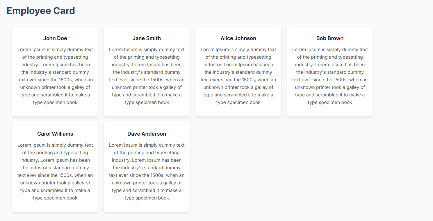
Employee List in Card Format with Detail View
<DatabaseQueryRenderer
  identifier="employee_card"
  title="Employee Card"
  layout="card"
  dbName="database-query-renderer-demo/employee.db"
  table="employees"
  fields=[
    "first_name || ' ' || last_name AS title",
    `"Lorem Ipsum is simply dummy text of the printing and typesetting industry..." AS description`
  ]
  where=""
  orderBy="first_name ASC"
  limit="6"
  detail={true}
  detailWhere={["title"]}
/>
⚠️ Important Notes
- All layouts can use any query, but the card layout must have a
titlefield infields. Thedescriptionfield is optional. - Detail view is only available for
cardandtablelayouts. - The
detailWhereprop determines which fields should be used to filter detail views.
🎨 Layout Options
| Layout Type | Description |
|---|---|
table | Displays the query result in a tabular format. |
json | Renders the query result as a JSON list. |
card | Shows the data as a card-based layout. |
🔹 More Examples
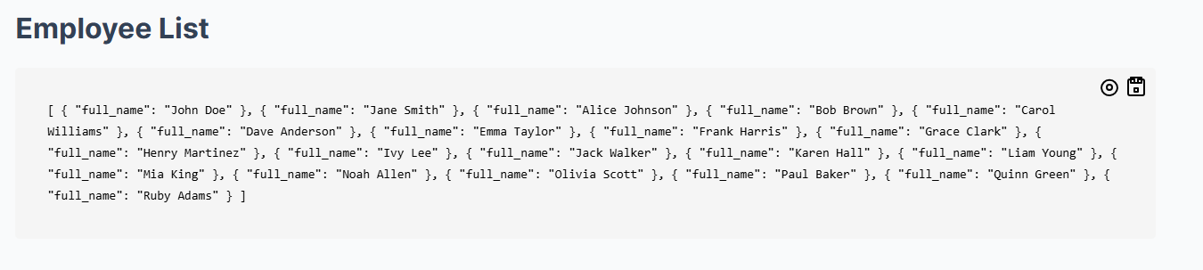
Employee List in JSON Format
<DatabaseQueryRenderer
  identifier="employee_list"
  title="Employee List"
  layout="json"
  dbName="database-query-renderer-demo/employee.db"
  fields={['*']}
  table="employees"
  where=""
  orderBy=""
  limit="2"
/>
Employee Table View with Detail View
<DatabaseQueryRenderer
  identifier="employee_table"
  title="Employee Table"
  layout="table"
  dbName="database-query-renderer-demo/employee.db"
  fields={['*']}
  table="employees"
  where=""
  orderBy=""
  limit="2"
  detail={true}
  detailWhere={["first_name", "last_name"]}
/>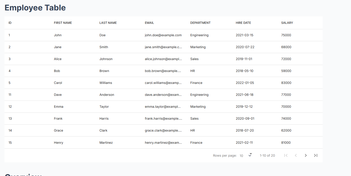
Employee Table Detail View
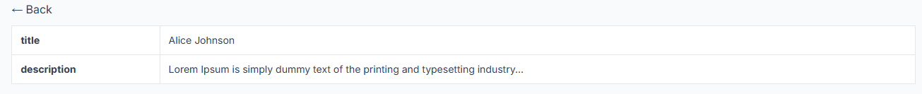
📌 Examples
⚙️ Props
| Prop | Type | Description |
|---|---|---|
identifier | string | Unique identifier for the instance. |
title | string | Title of the section. |
layout | "table" | "json" | "card" | Specifies the display format. |
dbName | string | Name of the SQLite database file. |
table | string | Name of the table to query. |
fields | string[] | Array of fields to select. Defaults to *. |
where | string | SQL WHERE clause. |
orderBy | string | SQL ORDER BY clause. |
limit | number | Limit the number of results. |
detail | boolean | Enables detail view (only for card & table). |
detailWhere | string[] | Fields to use for filtering in the detail view. |
🛠️ Error Handling
- If the database does not exist, an error message will be displayed instead of crashing the app.
- If
layoutis “card” andfieldsdoes not include atitlefield, an error will be thrown where the component is used. - If an invalid
layoutis provided, a default message is shown. - If
detailis enabled forjsonlayout, an error will be thrown.
📌 Notes
- The database file (
dbName) must be present in the working directory. - Ensure your SQL query returns data in a format suitable for the selected layout.
- The
detailfeature works only forcardandtablelayouts. - If working in a local environment, place the database in
database-query-renderer-demo/employee.db.
DatabaseQueryRenderer Demo
Team List from Database
The team list is rendered using the Astro component DatabaseQueryRenderer. This component fetches data from the database and displays it in a table format. To enable this feature, ensure the configuration in the .env file is updated correctly.
Configuration
- Update
.envFile
Set the database file path and enable the team list feature by updating your.envfile with the following variables:
# TEAM DB Configuration
PUBLIC_TEAM_DB="user_demo_db/resource-surveillance.sqlite.db"
ENABLE_DB_TEAM=truePUBLIC_TEAM_DB: Path to the SQLite database file (can be placed in any folder).ENABLE_DB_TEAM: Set totrueto enable the team list functionality.
- Placing the Database
The SQLite database is expected to be placed at the path defined in the.envfile (user_demo_db/resource-surveillance.sqlite.db), or you can specify any other valid SQLite file path in the.envconfiguration.
Team List Display
The team list is located in the file:
src/pages/team/index.astroWithin this file, the DatabaseQueryRenderer component is used to display the team members:
{
  teamDBConfig.isEnableTeamDB == "true" ? (
    <div class="p-6 pt-4 mt-3 mx-auto team-table-content">
      <DatabaseQueryRenderer
        identifier="user_card"
        title="Team Members"
        layout="table"
        dbName={teamDBConfig.dbName}
        table="uniform_resource_user"
        fields={["*"]}
        orderBy="Name asc"
      />
    </div>
  ) : null
}- identifier:
user_card– a unique identifier for the component. - title: The title for the table, set to “Team Members.”
- layout: Defines the layout of the data, in this case, “table.”
- dbName: The database name (set from the
.envconfiguration). - table: The table to fetch data from (
uniform_resource_user). - fields: Fetches all fields (
*). - orderBy: Orders the results by the
Namefield in ascending order (asc).
How to Use
- Make sure the database is placed at the location specified in the
.envfile, or update the path accordingly. - Ensure that the
.envconfiguration hasENABLE_DB_TEAM=trueto activate the database query. - When visiting the team list page, the data will automatically be fetched and displayed in a table format from the specified database.
Comments
To enable the comments section in specific markdown (.md or .mdx) files, set discussionsEnabled: true in the front matter. By default, the discussionsEnabled field is false, meaning the comments section will be hidden unless explicitly enabled.
discussionsEnabled: truelhc-forms-widget
Overview
lhc-forms-widget is an Astro component used to display LForms. Form definitions are stored in a JSON structure, which can be either:
- FHIR Questionnaire (recommended)
- LHC-Forms internal format
This component renders the form as HTML, making it easier to integrate structured forms into your Astro project.
Installation
Ensure that your project is set up with Astro and that the required dependencies are installed.
Environment Setup
Set the database path in your environment variables:
PUBLIC_LFORM_DB="path/db"This specifies the path where the LForms database is stored.
Usage
Import the LHCFormsWidget component into your Astro file:
import LHCFormsWidget from "../../components/lhc-forms-widget/lhc-forms-widget.astro";Use the component in your Astro template:
<LHCFormsWidget fileName={fileName} folderPath="lforms" />Parameters
-
fileName: The name of the JSON file containing the form definition. This file should be stored inside the specified
folderPath. -
folderPath: The folder that contains the form definition file. The base path is always
src/content/, so only the relative folder path needs to be provided.-
Example: If the form file is located in
src/content/lforms, setfolderPath="lforms". -
If the file is inside a nested folder, specify the full relative path. For example:
<LHCFormsWidget fileName={fileName} folderPath="folder/innerFolder" />
-
Handling Form Submissions
After submitting the LHCFormsWidget, the response is saved in:
src/content/lforms/submissionsas a JSON file.
This file needs to be ingested with Surveilr using the following command:
surveilr ingest files -r src/content/lforms -d src/content/db/lforms/resource-surveillance.sqlite.dbThis will create a database at:
src/content/db/lforms/Displaying Submitted Form Responses
Import the LHCFormsResponseWidget component into your Astro file:
import LHCFormsResponseWidget from "../../components/lhc-forms-widget/ihc-form-response-widget.astro";Use the component in your Astro template:
<LHCFormsResponseWidget fileName={submittedForm} />- submittedForm: The file name passed to
LHCFormsResponseWidgetis the JSON file generated after submitting the form.
File Structure
Ensure your project follows this structure:
project-root/
├── src/
│   ├── components/
│   │   ├── lhc-forms-widget/
│   │   │   ├── lhc-forms-widget.astro
│   │   │   ├── ihc-form-response-widget.astro
│   ├── content/
│   │   ├── lforms/
│   │   │   ├── example-form.json
│   │   │   ├── submissions/
│   │   ├── db/
│   │   │   ├── lforms/
├── .env
Notes
- It is recommended to use FHIR Questionnaire format for form definitions.
- The component will dynamically render the provided form as HTML.
- Submitted form responses can be ingested into Surveilr for further processing..
IMAP Mail Box Component
The imap-mail-box component is an Astro component used to display ingested emails from any mail source in EOH.
Environment Configuration
Before using the component, set up the required environment variables:
Required Environment Variables
| Variable | Description | Example Value |
|---|---|---|
ENABLE_IMAP_VIEW | Enable or disable IMAP ingestion (true/false). If true, it will ingest mail content. | true |
PUBLIC_IMAP_DB | Path to the IMAP database. Do not change this path. | src/content/db/imap-mail-db/resource-surveillance.sqlite.db |
IMAP_FOLDER | The IMAP folder to fetch emails from. | Inbox |
IMAP_USER_NAME | IMAP account username. | your_email@example.com |
IMAP_PASS | IMAP account password. | your_password |
IMAP_HOST | IMAP server host. | imap.example.com |
Setup & Running Locally
1. Install Surveilr
To complete IMAP ingestion, make sure you have Surveilr installed. If not, follow the installation guide:
2. Prepare the Database
After setting up the environment variables, run the following command in the root terminal:
pnpm run prepare-imap-dbThis command will automatically create the database in the specified directory.
⚠️ Make sure the target directory exists before running the command.
Using the Component in Astro
Astro SSR Requirement
The imap-mail-box component is built for Astro Server-Side Rendering (SSR) and will only work in SSR mode.
Importing the Component
To use the component in an Astro page, import it as follows:
import MailBox from "../../components/imap-mail-box/mailBox.astro";

<MailBox />
Query Parameters
- If no
accountID is passed in the URL (?account=****&view=list), the component will automatically select the first ingested account. - Required query parameters:
account→ Specifies the account ID.view=list→ Must be set to"list".
Example URL:
http://localhost:3000/?account=1234&view=list
⚠️ Ensure you follow the correct query parameter names to prevent bugs.
Live Demo
Notes
- The component will only display ingested emails if
ENABLE_IMAP_VIEWis set totrue. - Ensure that Surveilr is installed and configured correctly before running the ingestion process.
- Provide valid IMAP credentials and database configurations for successful ingestion.
Handling the Order of the Menu in Expectations/Questionnaire
Overview
This feature allows users to manage the order of menu items in the expectations/questionnaire section. Previously, the names of JSON files were displayed by the file order. With this new enhancement, users can now define the order according to their preferences.
Order File
A JSON file named order.json (do not change the filename) has been created to handle the menu order. This file is located at:
src/pages/expectations/order.json
The order.json file is generated using the NML Form Builder (National Library of Medicine). To edit this form, follow the steps below:
Editing the Order JSON
-
Navigate to the NML Form Builder: https://formbuilder.nlm.nih.gov/
-
Import the existing
order.jsonfile from:src/pages/expectations/order.json
-
Make necessary changes without altering the existing structure.
-
You can add more menus, but keep the existing format unchanged.
Example Structure
The questionnaire menu contains submenus such as:
Plan 1, Plan 2, Plan 3
These are folders that contain JSON files inside:
src/content/expectations/questionnaire/plan-1
When adding folders as groups:
-
Fill the field
Question text(menu name) -
Set
Data typetogroup
Creating Each Menu (e.g., General Information, Evidence Collection)
-
Click the three dots next to
Plan 1in the dropdown menu. -
Select
Insert a new child item. -
In the form filler that appears, fill:
-
Question text→ Menu name (e.g., General Information, Evidence Collection) -
Data type→text -
Initial value→ Path to the JSON file, e.g.,/expectations/questionnaire/plan-1/general-information-evidence-collection.lhc-form.json
-
-
Do not fill any other fields not mentioned in this README.

Exporting the Updated Order JSON
-
Click the Export button.
-
Select
Export to file in FHIR R4 format. -
The updated JSON file will download to your local
Downloadsdirectory. -
Rename the downloaded file to:
order.json -
Place the renamed file in:
src/pages/expectations
By following these steps, you can effectively manage the order of the menu while ensuring consistency in the JSON structure.
✏️ Edit Options (Edit on GitHub & Edit)
This feature adds flexible edit options in the footer of each page so users can easily update content.
🛠 Options provided
✅ Edit on GitHub
Provides a direct link to edit the page in the GitHub repository.
- When enabled, an Edit button appears in the footer.
- Clicking it takes the user directly to the GitHub editor for that page.
enableEditButton: true✏️ Edit
Lets logged‑in users edit the page directly on the website using a Markdown editor.
How it works:
- User must be logged in and have saved a valid GitHub Token in their profile settings.
- When the user clicks Edit in the footer:
- If the token is not set, a modal prompts them to go to profile settings and update it.
- If the token is set:
- The rendered content is hidden.
- The Markdown editor appears in the same page.
- After editing, the user clicks Submit:
- A prompt asks for a commit message.
- The changes are committed and pushed to the GitHub repository.
- The site’s build process auto‑triggers → changes go live.
Note:
To enable committing changes to the correct GitHub repository, make sure to set the following environment variables in your project:
PUBLIC_CONTENT_GITHUB_OWNER=<your-github-username-or-organization>
PUBLIC_CONTENT_GITHUB_REPO=<your-repository-name>
✨ Benefits
- Editors can choose between:
- Quick direct edits on GitHub.
- Editing directly in the site’s UI.
- Keeps all edits version‑controlled in Git.
- Faster edits without switching context.
📦 Flow summary
| Option | Flow |
|---|---|
| Edit on GitHub | Direct link to GitHub page editor |
| Edit | Checks token → shows markdown editor → commit & push → auto build |
🧩 Requirements for “Edit”
- User must:
- Be logged in
- Save a valid GitHub token in profile (with
reposcope)
- Backend/API to:
- Fetch user metadata (
getUserMetaData) - Commit changes and push to GitHub
- Fetch user metadata (
- Frontend containers:
#html-content→ initially shown#markdown-content→ initially hidden
🖼 UI overview
- Footer button: Edit
- Modal if token missing
- Markdown editor in page
- Submit button triggers commit
✅ Why this is useful
- Non‑technical users can fix typos or update content without using GitHub.
- Technical users still have the direct GitHub link.
- Every edit is tracked in Git history and triggers the build automatically.
Support & Feedback Widget
A JavaScript-based widget that allows users to submit feedback or support requests via a GitHub issue and send email notifications using Novu API.
🚀 Features
- Capture and upload screenshots to GitHub issues
- Create GitHub issues with user-submitted feedback
- Send email notifications to admins via Novu
- Acknowledge users with an automated email respons
Before using the widget, configure the following environment variables:
PUBLIC_NOVU_API_URL="novu-api-url"
PUBLIC_NOVU_SUBSCRIBER_ID="your-subscriber-id"
PUBLIC_NOVU_API_KEY="your-api-key"
PUBLIC_NOVU_CONTACTUS_TEMPLATE="contact-us-template"
PUBLIC_NOVU_CONTACTUS_ADMIN_EMAIL="admin-email"
PUBLIC_NOVU_ADMIN_TEMPLATE="novu-admin-template-id"
PUBLIC_GITHUB_PAT = "your-personal-access-token"
PUBLIC_GITHUB_OWNER = "your-github-username"
PUBLIC_GITHUB_REPO = "your-repository-name"
ENABLE_SUPPORT_AND_FEEDBACK=true
You can enable or disable support and feedback widget by setting the ENABLE_SUPPORT_AND_FEEDBACK variable to true or false.
Comment Integration
The Comment component allows users to add, view, and engage in discussions. It is integrated into the application and can be enabled or disabled based on the discussionEnabled flag.
Installation & Setup
Ensure that the following environment variables are set in your .env file:
- PUBLIC_RSSD_DB – Specifies the path to the resource surveillance database.
- PUBLIC_PRODUCTION_URL – Defines the production URL of the site.
- PUBLIC_NOVU_COMMENT_NOTIFICATION_TEMPLATE – Represents the template name used for comment notifications.
- PUBLIC_NOTIFICATION_FOR_ALL_MEMBERS - If set to “true,” the comment notification will be sent to all members; otherwise, it will be sent only to the mentioned members.
PUBLIC_RSSD_DB=src/content/db/rssd/resource-surveillance.sqlite.db
PUBLIC_PRODUCTION_URL="https://demo.hub.opsfolio.com"
PUBLIC_NOVU_COMMENT_NOTIFICATION_TEMPLATE="comment-template"
PUBLIC_NOTIFICATION_FOR_ALL_MEMBERS=false
Usage
To integrate the Comment component, import it and configure the required properties:
import Comment from "../../../components/comment/comment.astro";

<Comment source="EOH" discussionEnabled={true} />
If discussionEnabled is true, the Comment component will be displayed, allowing users to engage in discussions.
If discussionEnabled is false, the Comment component will be hidden, and no discussion-related features will be available.
Source could be a site name, module name, or specific section where the comments belong.
If using multiple sources, it ensures comments are grouped accordingly.
⚠️ Note
For the Comment component to function properly, make sure:
- The database is generated before using the comments feature.
- The
PUBLIC_RSSD_DBenvironment variable is correctly set in the.envfile.
Diagrams
Mermaid and Planthtml are tools for creating diagrams using simple text-based syntax. This document provides a guide on how to use both tools effectively in Markdown files.
To add Mermaid Diagram and Plantuml Diagram
- Mermaid Diagram
Example: Using Mermaid in Markdown (.md)
---
title: "Flowchart Example"
---

```mermaid
graph TD
    A[Start] --> B{Is it working?}
    B -->|Yes| C[Great!]
    B -->|No| D[Debug]
D --> Bℹ️ Info: Mermaid requires Node.js v20.9.0 or later to function properly.
- Plantuml Diagram
Install pnpm install astro-plantuml package using pnpm:
Add the below code snippet in astro.config.mjs
import plantuml from 'astro-plantuml';;
Add the below code snippet in astro.config.mjs defineConfig function
integrations: [plantuml() ]
Use the following code snippet to add a Plantuml diagram:
```plantuml
@startuml

class User {
    - username: String
    - password: String
    - email: String
    + login()
    + register()
}

class Product {
    - name: String
    - price: double
    - description: String
}

class Cart {
    - items: List<Product>
    + addProduct(product: Product)
    + removeProduct(product: Product)
}

User "has" --* Cart : "shopping cart"
User "can view" --* Product : "products"
Cart *--* Product : "contains"

@enduml
Enable or Disable Page History
To enable or disable page commit history, set the enablePageHistory variable in theme.config.ts file as
true or false.
Enable zoom for Plantuml diagram
To enable zoom for Plantuml diagram, include the tag<figure class="beoe mermaid"> Plantuml Script </figure> in the markdown as given below.
<figure class="beoe mermaid">
```plantuml
@startuml

class User {
    - username: String
    - password: String
    - email: String
    + login()
    + register()
}

class Product {
    - name: String
    - price: double
    - description: String
}

class Cart {
    - items: List<Product>
    + addProduct(product: Product)
    + removeProduct(product: Product)
}

User "has" --* Cart : "shopping cart"
User "can view" --* Product : "products"
Cart *--* Product : "contains"

@enduml

</figure>
📁 Box Folder Listing Integration
This setup enables fetching and displaying files from a Box folder using the Box API with refresh token authentication.
1. Create a Box Developer Account
- Go to https://account.box.com/login
- Sign in or create an account using your email.
2. Access Developer Console
- Navigate to the Box Developer Console: https://app.box.com/developers/console
- Create a new Custom App
- Choose
OAuth 2.0 with Refresh Token - Note down the following credentials:
- Client ID
- Client Secret
- Set the Redirect URI to
http://localhost:4321/box-authfor local testing orhttps://demo.hub.opsfolio.com/box-authfor live environment. - Enable the scopes
- Choose
3. Generate Authorization Code
https://account.box.com/api/oauth2/authorize?response_type=code&client_id=YOUR_CLIENT_ID&redirect_uri=https://demo.hub.opsfolio.com/box-auth
- Visit the URL in your browser replacing
YOUR_CLIENT_IDwith your actual client ID andYOUR_REDIRECT_URIwith your redirect URI. - Sign in and authorize access
- Copy the
codereturned in the URL
4. Exchange Code for Access & Refresh Tokens
Local Example
curl -X POST https://api.box.com/oauth2/token
-H "Content-Type: application/x-www-form-urlencoded"
-d "grant_type=authorization_code"
-d "code=REPLACE_WITH_AUTH_CODE"
-d "client_id=YOUR_CLIENT_ID"
-d "client_secret=YOUR_CLIENT_SECRET"
-d "redirect_uri=http://localhost:4321/box-auth"- Save the
access_tokenandrefresh_tokenfrom the response - Update box-auth.json with accessToken and refreshToken in the sr/keys path { “accessToken”: “xxxxx”, “refreshToken”: “yyyy” }
🌟 Functionality Achieved
The integration enables:
- Listing contents of a specific Box folder using the
/folders/:folder_id/itemsendpoint - Secure token management using the refresh token flow
Make sure to define the following in your .env file:
BOX_CLIENT_ID=your_client_id
BOX_CLIENT_SECRET=your_client_secret
BOX_FOLDER_ID=your_target_folder_id
Google Drive Demo Integration Setup
To enable private Google Drive access via a service account, follow these steps:
1. Create a Google Cloud Project
- Go to Google Cloud Console
- Click the project dropdown at the top bar → New Project
- Name it something like
Astro Private Drive Access - Click Create
2. Enable Required APIs
- Navigate to APIs & Services > Library
- Search and enable the following:
- ✅ Google Drive API
- ✅ Google Sheets API
3. Create a Service Account
- Go to IAM & Admin > Service Accounts
- Click Create Service Account
- Name:
astro-drive-access
- Name:
- Click Create and Continue
- (Optional) Skip the role or choose
Basic > Viewer - Click Done
4. Generate and Download Credentials
- Click on the service account name you just created
- Go to the Keys tab
- Click Add Key → Create new key
- Choose JSON
- A
.jsonfile will be downloaded automatically
5. Store the Credentials
-
Move the
.jsonfile to your project directory: src/keys folder -
Add the following to your
.envfile:
GDRIVE_JSON_PATH=src/keys/gdrive-sample.json📝 Blog
The theme contains the blog section of the site.
✨ Features
- Grid and list view toggle with icons.
- Blog posts fetched from Markdown files or content collections.
- Responsive design built with Tailwind CSS.
- Support for both featured images and thumbnail images.
🖼️ Featured & Thumbnail Images
Each blog post can define:
featuredImage→ a high-resolution image shown on the detail page.thumbImage→ a smaller image displayed in the grid or list view on the blog listing page.
✅ If featuredImage is not provided in the Markdown frontmatter:
- No image will appear on the detail page.
- It’s recommended to include a high-resolution image to keep the detail page visually engaging.
✅ If thumbImage is not provided:
- The system automatically uses the default thumbnail image: /assets/images/blog/blog-thumb.jpg
📦 Release Notes Feature
This theme can automatically fetch and display release notes from any GitHub repository.
Supports:
- Public repositories
- Private repositories (add a GitHub token in your
.envfile)
🔧 Setup
Define the repository you want to fetch releases from in your theme config:
// theme.config.ts
export default themeConfig({
  releaseListUrl: "ownername/reponame",
};
If the repo is private, create a GitHub Personal Access Token with at least repo:read permission, and add it to your .env file:
PUBLIC_RELEASE_NOTES_GITHUB_TOKEN="ghp_XXXXXXXXXXXXXXXXXXXX"This token should belong to a user who has read access to that repository.
⚙️ How It Works
-
If a token is present: always uses it for API requests.
-
If no token: tries unauthenticated request (works for public repos).
-
If the repo is private and no valid token: shows a friendly message in the UI:
“We couldn’t find the repository or it might be private. Please check the repository URL in theme.config or add your GitHub token in the .env file.”
Note:
You can fetch release notes from any repository—even if your site itself lives in a different repo.
Just make sure the token (if used) has access to the target repository.
🔧 Configurable Widget Titles and Entry Limits
This update introduces support for configurable widget titles and entry limits for homepage widgets such as Key Resources, Meeting Minutes, Skip to…, IT Governance, Risk and Compliance, Trackers, Featured Blogs,Plan of Action and Milestones (POA&M), POA&M Status Updates, Plan of Action and Milestones (POA&M) - Next Steps and POA&M Progress Update.
You can now customize:
- Widget label - display name for the section.
- Value - identifier used in content filtering.
- Limit - number of items to show before “View More” appears. Example configuration (theme.config.ts):
widgetTitle: [
    { label: "Key Resources", value: "keyResources", limit: 5 },
    { label: "Meeting Minutes", value: "meetingMinutes", limit: 5 },
    { label: "Skip to...", value: "skipto", limit: 5 },
    { label: "IT Governance, Risk and Compliance", value: "itGovernance", limit: 5 },
    { label: "Trackers", value: "trackers", limit: 5 },
    { label: "Featured Blogs", value: "featuredBlogs", limit: 5 },
    { label: "Plan of Action and Milestones (POA&M)", value: "poamMilstones", limit: 5 },
    { label: "POA&M Status Updates", value: "poamStatusUpdates", limit: 5 },
    { label: "Plan of Action and Milestones (POA&M) - Next Steps", value: "poamNextSteps", limit: 5 },
    { label: "POA&M Progress Update", value: "poamProgressUpdate", limit: 5 },
  ]
Enjoy building with the EOH Astro 5 Theme!! 🚀